The Incredible Potential Of Landing Pages
A landing page is a website page, but the kind of page I am discussing here is a specific standalone web page disconnected from your usual website menu system, rather like a full-page advertisement for a specific product or event.
Tip: The Incredible Potential Of Landing Pages - is also available as an ebook (pdf) for offline reading.
Let me explain what a landing page is and the many ways that you can use landing pages for online marketing and e-mail collection.
Landing Pages are very special pages that can help you improve your online marketing. They are designed and built for one main purpose: it serves as a call-to-action (CTA) for its readers. In this e-book, I will show you their incredible potential and explain why and how they are used.
What is a landing page?
Standalone webpage
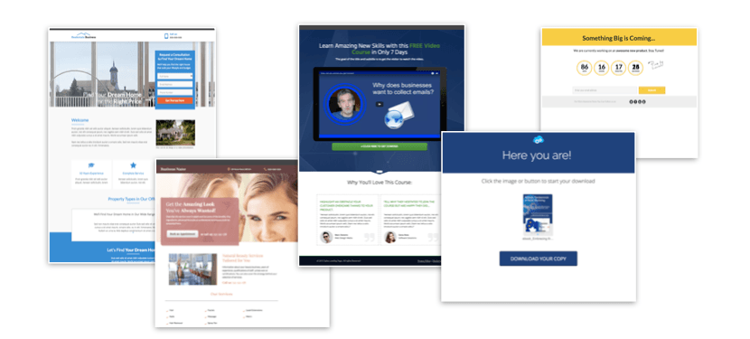
A landing page is a specific standalone webpage that is disconnected from your usual website menu system. It is created for the sole purpose of convincing the reader to opt in or sign up to the item on offer.
It is a full-page advertisement for a specific product or event.
The idea is to make its contents enticing enough to make your visitors subscribe to your deal. Done right, it will ultimately increase your main page’s traffic and/or your business’ revenues.
The essential elements of landing pages
Creating a successful landing page
- 1No distractions from core purpose
- 2No website menus
- 3List Great & engaging headline
- 4A compelling offer
- 5Call-to-action
- 6Mobile-friendly
1. No distractions from core purpose
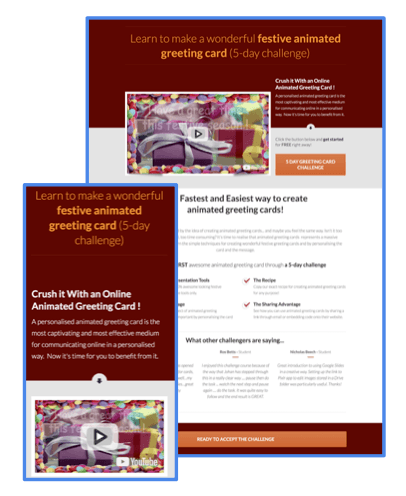
An effective landing page has no distractions from its core purpose, which is to encourage the reader to opt in or to sign up for just one offering. To establish such purpose, it should answer this one main question: What is the specific conversion goal this page should drive visitors towards? Every bit of wording on the landing page should relate to that one topic. Make its contents revolve around this to keep your readers from being distracted
2. No website menus
There should be no website menus nor navigation links other than the sign-up form. There should be no link to your main site, and no link to any other place where the reader can be drawn into moving away from the page, except to close it or to engage with the call-to-action. Limiting the number of clicks they have to do should make it easier for them to act on your offers
3. Great & engaging headline
One of the most effective ways to catch your readers’ attention is by using great and engaging headlines. Always build your landing pages with a big headline that directly communicates your unique selling point. It should arouse curiosity and make the visitor want to read more.
4. A compelling offer
What are the vital things that you want your visitors to know upon reaching your landing page? Although it is very tempting to go all out when it comes to highlighting the positives of your offer or product, make sure that you don’t overdo it. Go right to the point even though there is a lot to tell about your business. A few lines of text will do, but above all, make it a valuable offer.
5. Call-to-action
A call-to-action will be something that the reader can click –– for example, it may say “Buy now”, “Tell me more”, or “Join event”. In these examples, this is either getting an e-mail lead (consisting of an opt-in form and a call-to-action) or making a sale (consisting of a purchase button and a call-to-action). Everything you do on this page will be focused on getting visitors to perform this “end” action. Make sure your CTA is clear and visible. If visitors don’t notice your CTA, you won’t be able to convert their clicks into valuable transactions.
6. Mobile-friendly
With the use of mobile phones steadily increasing at this day and age, a compelling landing page will need to be mobile-friendly. Since the style of a landing page needs to emphasise a call-to-action without being distracted by navigation, the layout of a mobile page is highly suitable for such a simple scroll-down menu.
Optional elements of an optimized landing pages?
Making your landing page even more effective
- 1Elegance
- 2Images and visuals
- 3Bullet lists
- 4Text section
- 5Testimonials
- 6Videos
- 7Risk Reversal
1. Elegance
Make your design and layout as elegant as possible. If you want to convert your viewers into leads and customers, you will need to offer a seamless experience on your landing page by using clear language with a clean design.
2. Images and visuals
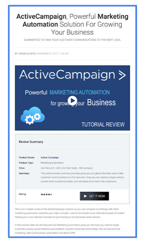
Using images or visuals (such as charts) makes your product more real and tangible to your visitor. It must be a visual image that represents the thing your visitor will get when they complete your call-to-action. The “what you get” module on your landing page has one simple purpose: to make it unmistakably clear to your customer what they will receive after pushing through with the purchase.
3. Bullet lists
Use bullet lists or any other kind of list for that matter. They are a great way to deliver your message in a compact, easy to read format. Here are some of the things that you can write on your list:
4. Text section
To ensure that you convert your visitors into customers, you need to choose your words wisely. Here, you can explain what exactly sets your business apart from your competitors. Target your visitors’ specific problems to compel them to take action. It is also important to address objections and explain why they shouldn’t be scared or hesitant to take your offer.
Learn About The Potential Of Landing Pages To Boost Your Online Marketing And Email Collection in this free guide #intelliweb
5. Testimonials
Get endorsed with a testimonial. Testimonials are a great way to add social proof that can help increase your conversion rate. Your visitors are more likely to get convinced of your product’s reliability when they see what others think about it.
6. Video
Include a video that highlights your visitors’ problems, why it is frustrating, and explain how your product can help them solve it. If they feel that you know exactly where they are coming from, they will be more likely to give your product a chance.
7. Risk Reversal
Don’t forget to include risk reversals if you are building a landing page that involves product purchases (e.g. “money-back guarantee”). It should be a clear statement that tells customers that they can easily and quickly get a refund in case they are not satisfied.
How does a landing page work?
Drawing attention to your landing page
Suppose that you have already taken the time to build a landing page. The next question now is: how will people find it? A landing page of course has a URL, which the reader can click and reach via any external link.
URL = http://www.etcetera.com

This can be from any of the following:
- 1an online advertisement
- 2a social media page
- 3a webpage
- 4an e-mail
Although having a main website can be helpful if you want people to know more about you, you do not need to have a website in order to draw attention to your offering online!
The purpose of landing pages
Why landing pages are worth the effort
1. Collecting Leads
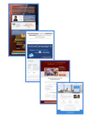
Essentially, a landing page can be a way to obtain someone’s e-mail address or other contact details. Some people simply ask for this information, while others promise some kind of value in return.
The pages that offer something in return are often called ‘squeeze’ pages, but are in fact landing pages.
2. Purchasing a Product
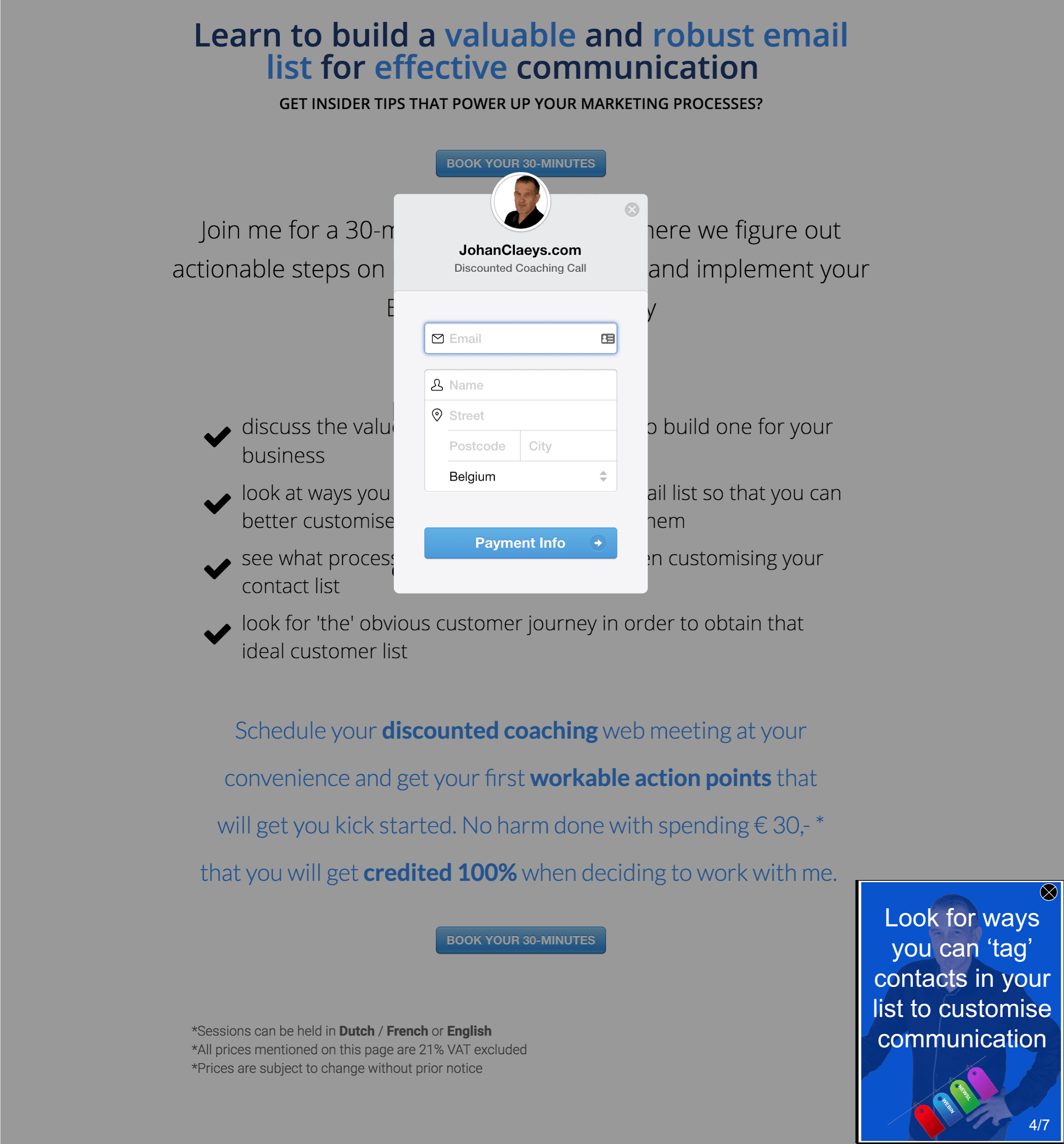
Landing pages are an invaluable tool for making sales. You give visitors one simple choice: to buy your product or service. It might be a product purchase landing page, an online course, a coaching session, a webinar, an e-book, etc.
3. Registering for an event
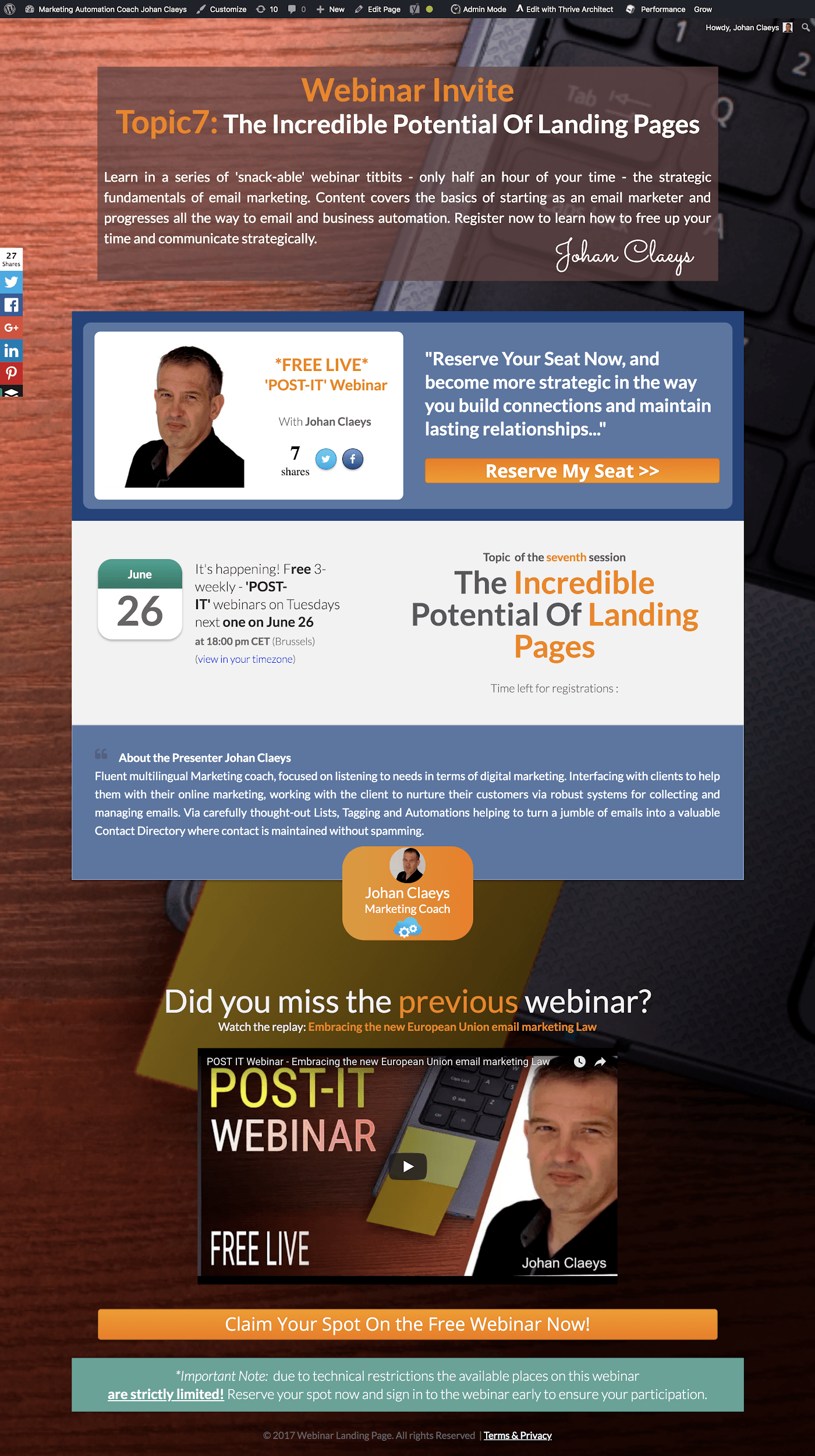
Organise webinar campaigns to announce your live online events and use a landing page where people can sign up for their attendance.
Events are a great way to connect with prospects, gain more leads, and even sell online.
4. Affiliate Marketing

Affiliate marketing is an online business method where marketers sell another company’s product or service and receive a commission from any sales they drive.
Affiliate marketing is a perfect use for landing pages because they’re easy to set up and drive traffic to.
Here you could think of:
In fact, you are actually helping that person, the affiliate marketer, to earn a small income for recommending this solution.
5. Distributing Content
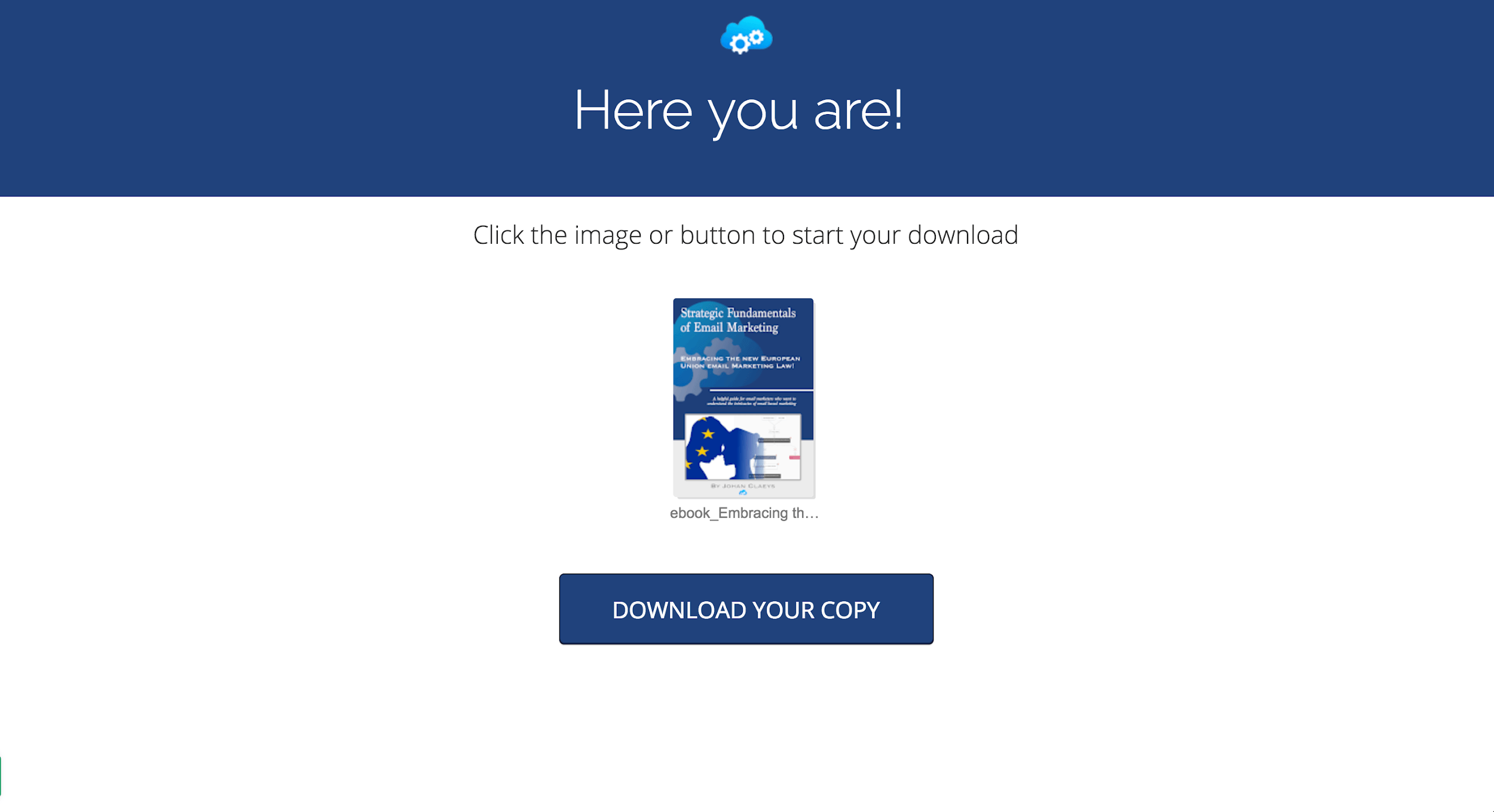
Look at ‘distributing content’ pages as a strategic marketing approach focused on creating and distributing valuable, relevant, and consistent content to attract and retain a clearly- defined audience. The main goal is to create a piece of content and trade it for a prospect’s e-mail address via a digital exchange.
It could be anything from a consultation, a piece of content, a free online course, a compilation of podcast episodes, etc. It’s not only a way of building foundations with potential customers but it builds trust with your visitors from the start.
6. Video Marketing
Driving traffic using a YouTube, Vimeo, or Wistia link can be really helpful because of its audiovisual element. Creating a video gives you more control in terms of the message that you really want to convey. If you are able to put up a video that is both visually appealing and persuasive, you have more chances of turning your viewers into leads and customers.


Creating landing pages
The tools you need for building your page
Landing pages need not be complicated, and there are some great standalone applications that can help you create one with ease. Such applications include Instapage, Convertflow, Clickfunnels, Unbounce, GetResponse, and HubSpot. For a price, they have ready-to-use templates that you just need to copy and modify according to your specific needs.
For those who are working on a tight budget, Google Sites can help you create free landing pages using Google forms within a Google subdomain. You can pay on a monthly basis as part of a G-Suite plan for custom domains.
If you do have your own website –– such as a WordPress site –– then you can buy plug-ins that allow you to build landing pages within your website, yet bypassing the distraction of the website navigation.
Here are some examples of WordPress Landing Page Builders:
- 1Thrive Architect
- 2OptimizePress
- 3LeadPages
Email Service Providers
Choosing an e-mail service provider for your landing page.
Remember that the call-to-action form on your landing page should optimally link up to an e-mail service provider so that you can turn your e-mail list into a real resource. Partnering up with a reliable e-mail service provider ensures that you get to have a meaningful exchange with your potential customers. Some examples of ESPs include MailChimp, AWeber, ConvertKit and ActiveCampaign.
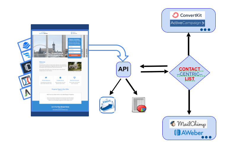
API - Application Programming Interface

In other ebooks from this series, I have discussed what happens to the e-mail details once the form has been filled out and submitted. In such cases, it is best to set up the integration before the landing page is actually created. This will allow you to start collecting e-mail leads the moment your landing page goes live.
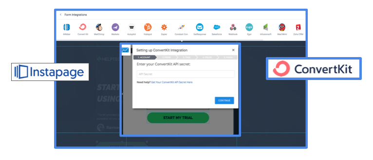
Landing Page Builder and ESPs
A landing page builder lets you choose which ESP to link to through API. In a standalone landing page builder like Instapage, you can both build your form and set up your API connection right within Instapage. As you see, it is capable of supporting various ESPs
Split-testing landing pages and lightboxes
Is there a perfect landing page?
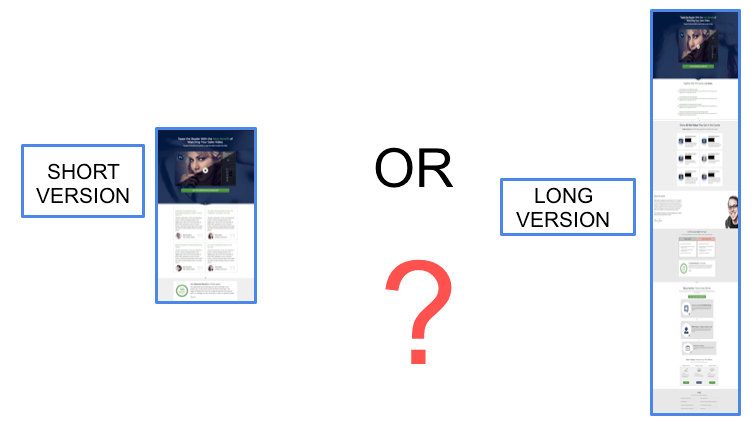
What does the “perfect” landing page look like? Unfortunately, there is no way to tell how “perfect” a landing page is right off the bat unless you conduct a test. Split testing, which is also referred to as A/B testing, involves two landing pages (e.g. webpages or e-mails) that are compared to each other side by side.
The objective is to see which one is more effective in getting users to take the desired action (e.g. signing up, purchasing, etc.).
Basically, you create two separate versions of a landing page that differ slightly to display to an equal portion of your traffic. Once a representative number of visitors has been driven to both versions over a long enough test period, the version where most of the users took the desired action will be deemed to be the more effective version. It will then be displayed by default after the test period.
Ideally, A/B tests would isolate one variable at a time such as headline, button color, background image, etc. However, you can also isolate a light box on your landing page to conduct an A/B test on these.
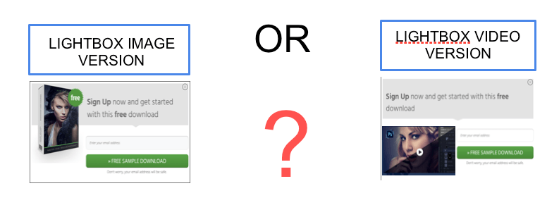
Testing is very important for two reasons:
Example of A/B testing headlines
I am in the “Thrive Headline Optimizer” dashboard and I'm going to show you how you can create a headline A/B test directly to test your landing page in WordPress.
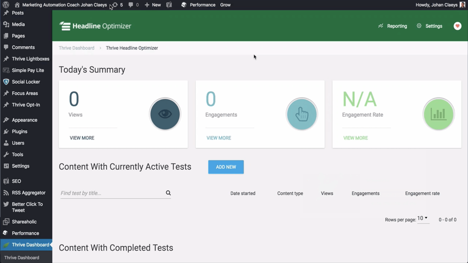
The Thrive Headline Optimizer is a plug-in which you can install straight into your WordPress environment. The only settings you need to indicate are the success metrics for your A/B headline testing.
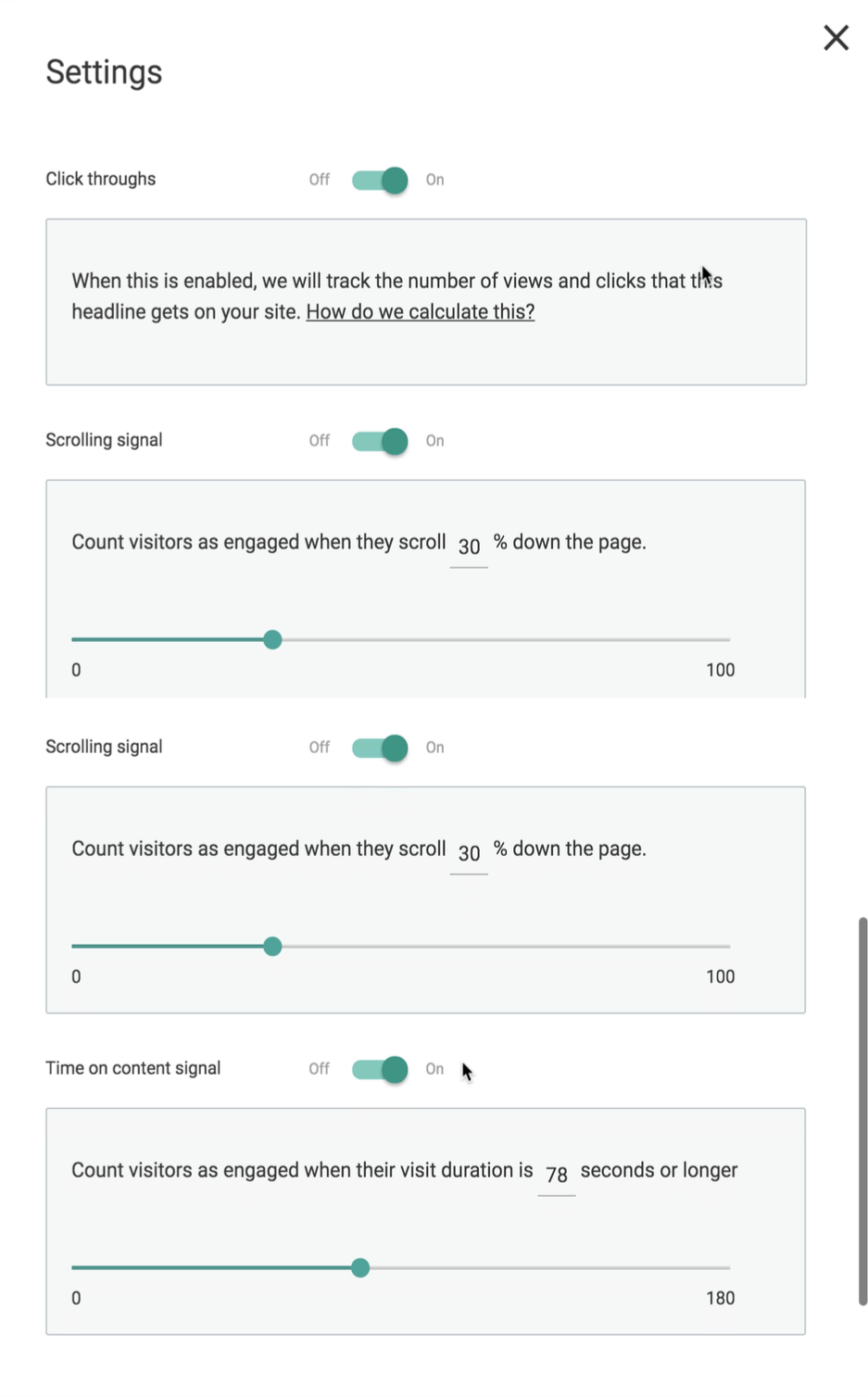
So once you have set that up, you can go to your landing page for which you want to do the headline A/B test in WordPress and edit the page.
I indicate a second headline and I can add even another variant and once you have indicated you update your page.
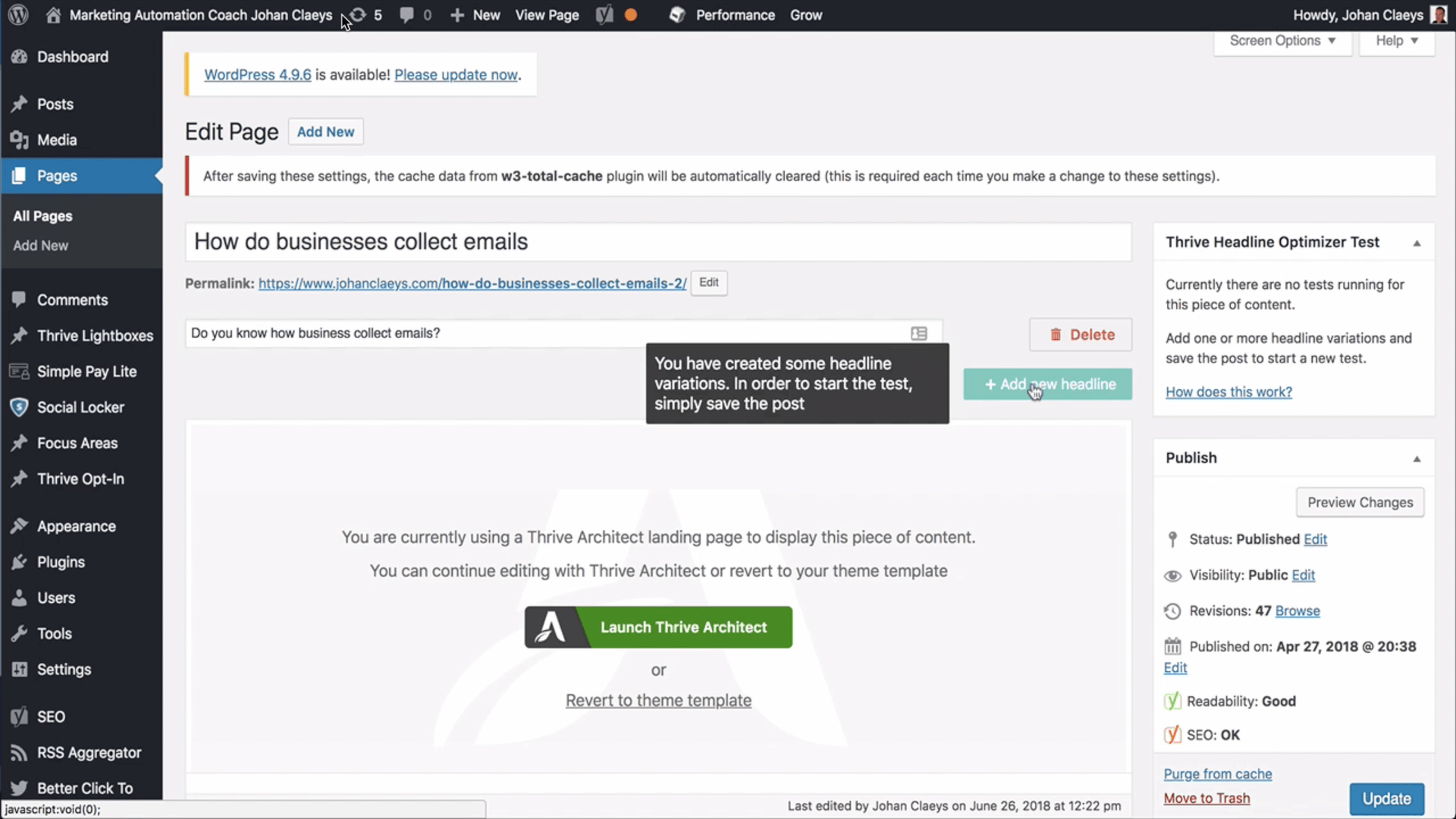
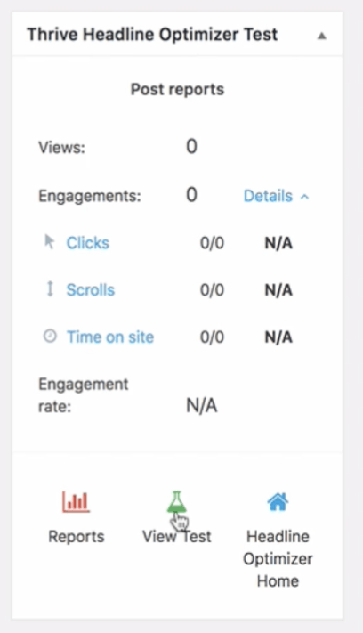
On the right you will see the Thrive Headline optimizer gadget and you can also check out the test results.
So up here you will see the engagement rate over time, but since we have just set it up there is no test data available yet. You will also see the different metrics for each of the headlines and from here you will be able to stop the test and choose the winner.
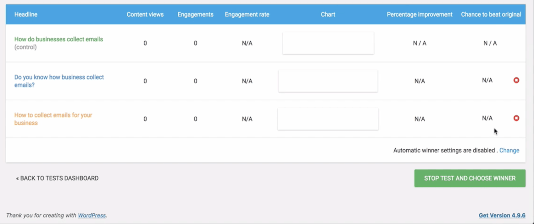
If you see that the metrics are in favour of the first headline, you indicate that headline as the winner. This is quite a straightforward solution that I really recommend for WordPress users.
Creating & testing items that link to your landing page
Traffic driving to your landing page
Search engines look for the presence of keywords on a page to determine what to rank them for. However, this doesn’t mean that you need to repeat keywords over and over in your sentences just to try to rank those words. You also do not need to write with unnaturally long paragraphs that provide more keywords. Write in your own voice, write well, and write naturally, and your landing page will find its way to a good ranking on search engines.
Here is a landing page template from ThriveArchitect:
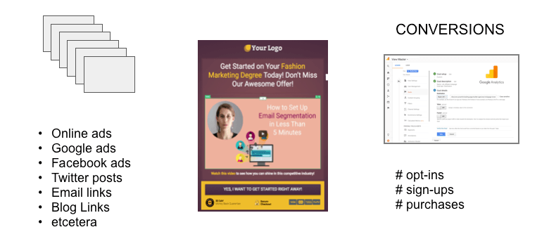
All traffic driving to your landing page
All traffic driving to your landing page
Conversion tracking
Conversion tracking allows you to check how your landing pages are performing. Use Google Analytics to tracking your goals such as opt-ins (simple conversions) and product purchases.
For example, if you have a primarily Spanish audience who buys goods, it might be worth it to set up Spanish product purchase landing pages to increase sales.
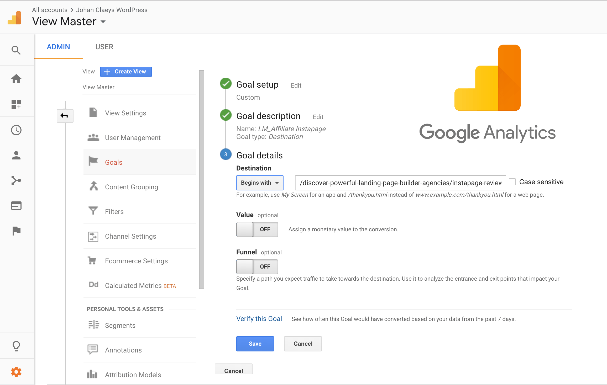
Consider setting up goal tracking in your analytics as a good investment that is well worth your time.
How do I get started?
Short-cutting with templates
Most landing page builders offer large collections of free landing page templates.
Before choosing a template, make sure that you know the goals of your landing page. Each template is designed to serve a particular purpose. Hence, choosing the wrong template can do more harm than good for your traffic, conversion, or sales.

Choosing a solid landing page template is also the best way to ensure that its design conforms to today’s HTML standards. This includes being optimised for mobile phones and the purpose for which it is built.
Applications like the ones we have just seen generally offer templates so that you can conveniently create your own landing page by simply changing a few words and elements.
When done well, a landing page is a powerful tool that will not only help you grow your mailing lists, but will also help you ignite profitable relationships with potentially loyal clients.
Conclusion
Landing Pages truly…
have the greater chance to result in responsive and active customers
EBOOK
BLOG CATEGORIES
RELATED POSTS
BUILD YOUR MAILING LIST
